info@three6ixty.co.za
 +27 64 525 7978
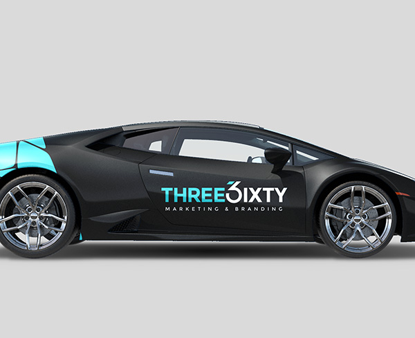
A branded vehicle stuck in traffic and a wrapped building on a busy road can both get attention, but they do it in very different ways. For a business considering vehicle branding in South Africa, the real question is not which surface is bigger or more noticeable at first glance. It is where the brand will be seen, how long people have to read it, and what the artwork needs to do in that moment.
A moving vehicle has to make an impression quickly. A building surface can hold attention for longer, but only if the placement and message make sense from the street. A blank wall, a shopfront window or a company vehicle may all feel like unused space, yet each one needs a different branding decision.
How vehicle branding in South Africa and building signage work differently
Vehicle branding is best understood as mobile brand exposure. The vehicle carries the brand into different streets, parking areas and customer-facing spaces. Building signage works from a fixed point. It gives one location a stronger presence and helps people recognise where the business is, what it does or how it wants to be remembered.
That difference affects almost every creative choice. A vehicle may be seen for a few seconds while it moves past another driver. A building wrap or larger sign may be seen by the same people repeatedly because they pass that location often. Neither is automatically better. The stronger choice depends on whether the brand needs to travel or anchor itself to one place.
This is also why larger surfaces need restraint. More space does not mean more information should be added. The bigger the surface, the more important it becomes to decide what must be noticed first.
Movement changes how people read the brand
A vehicle does not give people much time. It may be parked outside a client’s premises one moment and moving through traffic the next. That means vehicle artwork should work quickly from the side, rear or front angle where people are most likely to see it.
For most branded vehicles, the strongest layout is usually clear and uncluttered. A recognisable logo, simple brand colours and one readable contact or service message will often work harder than a crowded design. Fine text, long lists and small details can disappear once the vehicle is in motion.
A fixed building surface allows a different approach. A person walking past a window or slowing down near a premises may have more time to take in the design. Even then, the artwork still has to suit the viewing distance. A wall seen from across the road should not be treated like a flyer.
Fixed signage works hardest when the location already matters
Building signage has one major advantage: it can make a physical location easier to notice, recognise and remember. This matters when the premises itself plays a role in the customer journey. A strong sign can help people identify an entrance, connect a business name with a place they pass regularly, or understand that they have arrived at the right site.
Placement has to be judged carefully. A sign that faces slow-moving foot traffic can carry more detail than one facing a faster road. A high wall may give scale, but height can make smaller words difficult to read. A window may be close to the viewer, but reflections and interior lighting can affect how the design is seen during the day.
This is where practical planning matters. Before deciding on building wraps, window graphics or other branded signage, it helps to stand where people will actually view the surface. The artwork should be checked against that real distance, not only on a screen. For fixed outdoor installations, it is also worth checking the relevant outdoor advertising by-law before production begins.
Surface size can help or hurt the message
A larger surface gives the brand more room, but it also makes poor layout choices more obvious. If the logo, colours and copy do not work together, a big sign can start to feel noisy. If the artwork is too plain for the space, the branding may feel underused.
Vehicle surfaces come with their own limits. Doors, handles, windows, curves and panel breaks can interrupt the design. A layout that looks clean on a flat proof may not read the same way once it is placed across a vehicle body. The design needs to respect the shape of the surface.
Building surfaces may feel simpler because they are often flatter, but they can have their own interruptions. Corners, window frames, pillars and changes in wall texture can affect the final result. A good branding decision takes the surface seriously before the artwork is finalised.

Artwork readability matters more than decoration
Larger-format branding is usually easier to understand when it works from the first look. It should not ask people to study the detail before they understand the business name or main message. This matters for printed vinyl on a vehicle, a shopfront panel or a larger wall surface because the viewer may be distracted, moving or too far away to read small copy.
Before approving artwork, ask what a person should remember after only a few seconds. If the answer is the business name, the layout should make the name dominant. If the surface needs to point people to a location, direction and clarity become more important than visual complexity.
The same thinking applies to vinyl, vehicle branding and building wraps. The surface may change, but the brand still needs a clear hierarchy: what is seen first, what supports it, and what can be left out.
When a vehicle surface makes more sense
Vehicle branding may be the stronger route when the business already has vehicles moving between customers, sites or regular appointments. The vehicle is already part of the working day, so the branded surface travels with the business rather than waiting at one location.
It can also make sense when the brand needs to appear in different parts of a city or region. A vehicle parked outside a customer site can quietly support recognition without needing a separate sign at that location. The message should still stay simple because the vehicle may be seen from different angles and at different speeds.
For businesses thinking about fleet branding, consistency becomes especially important. Even if each vehicle has a different shape or size, the brand should feel like it belongs to the same company. Colour use, logo placement and message structure need to work as a system rather than as separate once-off designs.
When a building surface makes more sense
Building signage may be the better choice when the physical premises needs to carry more of the brand. A blank frontage, large window or visible wall can help a business look more established in the place where customers, staff or suppliers already arrive.
The fixed nature of the surface is useful when the same people pass the area often. Repeated exposure can help the location become familiar, especially where the sign is easy to read and the design fits the building rather than fighting it.
Large building surfaces also need more care around proportion. A small logo floating in a wide space may look weak. A design that covers too much without enough breathing room may feel cluttered. The aim is to use the size of the surface without letting the design become heavy.
Questions to answer before asking for signage advice
A useful enquiry usually starts with the surface, not the artwork. A clear description of where the branding will appear makes it easier to think through scale, readability and brand fit. Photos, measurements and a short explanation of how people will see the surface can help shape a more practical discussion.
Before moving ahead, it is worth clarifying:
- Whether the surface is moving or fixed.
- How far away people will be when they see it.
- What one message must be understood first.
- Whether the branding needs to match existing signage or vehicles.
- What physical details may interrupt the design.
This keeps the conversation practical. It also helps avoid the common mistake of treating every large surface as a blank canvas. A vehicle panel, glass frontage and building wall all behave differently once the brand is applied.
The stronger choice is the one that fits the viewing moment
Vehicle branding suits movement. Building signage suits place. Printed vinyl, PVC signs and other custom signage formats can support physical brand visibility, but the surface should never be chosen only because it is available or large.
Start with the moment in which the brand will be seen. Is someone driving past, walking closer, sitting behind the vehicle in traffic or arriving at the premises? Once that is clear, the design has a better chance of doing its job without being overloaded.
Plan your branded surface with practical signage advice
If you are planning a branded vehicle, building wrap or larger signage surface, speak to the team about the space, viewing distance and artwork requirements before committing to a final direction. A practical signage enquiry can help turn an underused surface into a clearer brand touchpoint.