Every successful corporate event begins long before the first guest arrives. It begins with clarity. Clarity of purpose. Clarity of message. Clarity of presentation. And at the centre of that clarity is A Strong Visual Identity That Sets the Tone. In the world of corporate golf days and branded events, visual identity is not decoration. It is structure. It tells guests what kind of event they are attending. It tells sponsors how professionally their brand will be presented. It tells clients whether this is a business that pays attention to detail. Three6ixty builds branded corporate events around the principle that a strong visual identity is not optional — it is foundational. From logo placement and colour consistency to brand message alignment and event theme cohesion, every element must work together. Because when the visual identity is strong, the event feels organised. And when the event feels organised, the brand feels credible.
Three6ixty Understands That A Strong Visual Identity That Sets the Tone Begins With Intention
A visual identity does not happen by accident.
It is not simply a logo on a banner or a colour chosen at the last minute. It is a deliberate system that governs how the brand appears across every touchpoint.
Three6ixty approaches event branding by first defining the intent behind the event.
Is the corporate golf day:
- a client appreciation event?
- a sponsor-driven networking platform?
- a brand awareness activation?
- a company milestone celebration?
- an annual signature event?
The purpose of the event informs the event theme, which informs the design direction.
Without intention, branding becomes inconsistent. With intention, branding becomes structured.
Three6ixty Builds A Strong Visual Identity That Sets the Tone Through Concept Development
Before any print collateral is produced or apparel is ordered, Three6ixty develops the event concept.
Three6ixty Defines the Event Theme Before Production Begins
An event theme does not have to be dramatic. It simply needs to be clear.
The theme may be:
- minimalist and premium
- bold and high-impact
- traditional and corporate
- modern and energetic
- heritage-focused
- sponsor-led
Once the event theme is defined, every visual element aligns with it.
Three6ixty ensures that the theme influences:
- typography
- colour direction
- logo placement
- signage layout
- apparel styling
- print collateral structure
This is how A Strong Visual Identity That Sets the Tone is established from the beginning.
Three6ixty Prioritises Logo Placement as a Strategic Decision, Not a Decorative One
Logo placement is one of the most misunderstood aspects of event branding.
Many organisers treat logo placement as a matter of fitting as many logos as possible into available space. This approach creates clutter and reduces impact.
Three6ixty treats logo placement as a strategic decision.
Three6ixty Uses Structured Logo Placement to Protect Brand Integrity
Logo placement must consider:
- hierarchy (host brand vs sponsor brands)
- size proportion
- visual balance
- spacing
- context of use
For example:
- A host brand may appear prominently on welcome signage.
- Sponsors may be grouped according to tier.
- Apparel may feature subtle placement for sophistication.
- Print collateral may include structured sponsor blocks.
When logo placement is managed correctly, it enhances brand message clarity rather than distracting from it.
Three6ixty Ensures Colour Consistency Across Every Touchpoint
Colour consistency is one of the fastest ways to create visual cohesion.
When colours shift slightly between banners, shirts, signage, and printed materials, guests may not consciously notice — but they feel the inconsistency.
Three6ixty ensures colour consistency by:
- matching brand guideline colours precisely
- aligning digital artwork with print output
- coordinating apparel shades with signage
- ensuring sponsor colours do not clash
- balancing dominant and secondary colours
Three6ixty Uses Colour Consistency to Reinforce Brand Message
Colour influences perception.
Deep tones may suggest authority and stability.
Bright tones may suggest energy and innovation.
Neutral tones may suggest sophistication and restraint.
Three6ixty aligns colour consistency with the brand message the event is intended to communicate.
When colour remains consistent across the course — from signage to uniforms to print collateral — A Strong Visual Identity That Sets the Tone becomes visible immediately.
Three6ixty Aligns Brand Message With Visual Identity
Brand message is not only expressed in words. It is expressed visually.
An event claiming to be premium must look premium.
An event claiming to be innovative must look modern.
An event claiming to value professionalism must look organised.
Three6ixty ensures that visual identity supports the intended brand message.
Three6ixty Connects Brand Message to Design Choices
Brand message influences:
- layout style
- typography selection
- imagery usage
- tone of printed materials
- balance of whitespace
- overall composition
If a brand message focuses on clarity and structure, the design must reflect clarity and structure.
If a brand message focuses on bold market presence, the design must reflect confidence.
A mismatch between message and presentation weakens credibility.
Three6ixty ensures alignment.
Three6ixty Creates Visual Identity Systems That Extend Beyond One Day
Corporate golf days may last a single day, but the brand impact should last much longer.
A strong visual identity should extend across:
- pre-event marketing
- digital invitations
- sponsor announcements
- event signage
- apparel
- prize-giving backdrops
- post-event social media
Three6ixty ensures that A Strong Visual Identity That Sets the Tone is visible across all stages of the event lifecycle.
This creates continuity and reinforces recognition.
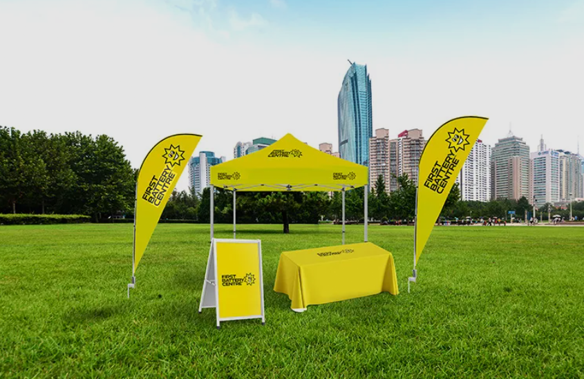
Three6ixty Designs Registration Areas to Reflect the Event Theme
The registration area is often the first branded environment guests experience.
If the visual identity is weak here, the tone of the entire day is affected.
Three6ixty ensures that registration branding includes:
- structured welcome boards
- consistent logo placement
- coordinated colour use
- aligned apparel for staff
- print collateral that matches signage
This ensures the event theme is communicated clearly from the start.
Three6ixty Maintains Visual Identity Across the Golf Course
A corporate golf day is not contained in one room. It spreads across a full course.
Maintaining visual identity across multiple holes, sponsor areas, refreshment points, and prize-giving spaces requires planning.
Three6ixty ensures that:
- signage layouts follow a consistent design template
- sponsor boards respect hierarchy
- colours remain consistent across large-format printing
- event theme elements are repeated strategically
- directional signage aligns visually with branding
This prevents the course from feeling like separate events happening simultaneously.
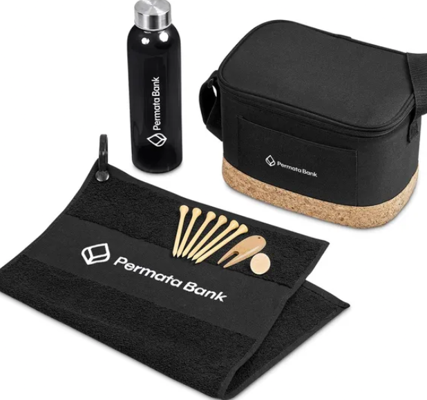
Three6ixty Protects Visual Identity in Apparel and Uniforms
Custom apparel is part of the visual system.
If uniforms do not match signage or the event theme, cohesion is lost.
Three6ixty ensures that:
- branded shirts follow the event’s colour palette
- caps align with logo placement standards
- jackets reflect the same design language as print collateral
- staff uniforms communicate professionalism
Uniformity supports A Strong Visual Identity That Sets the Tone across human interaction.
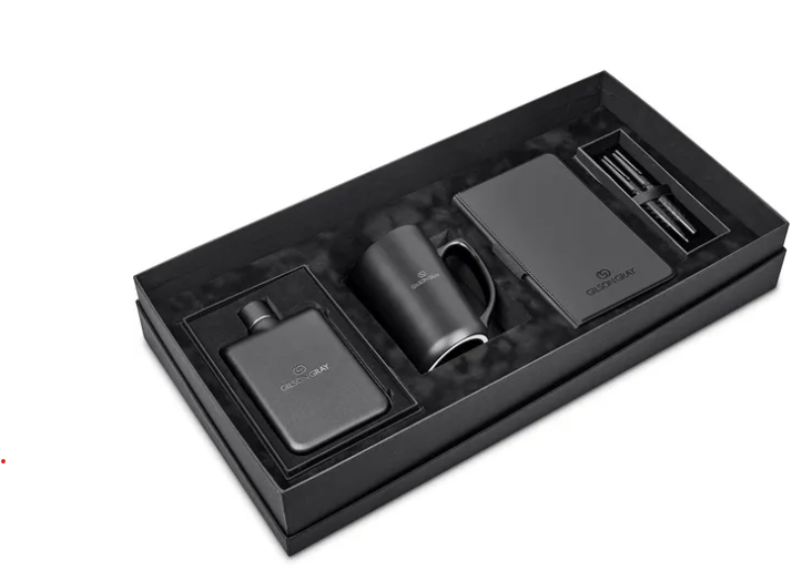
Three6ixty Ensures Print Collateral Reflects the Event Theme
Print collateral includes:
- scorecards
- event programmes
- table cards
- menu boards
- sponsor recognition inserts
These items are handled closely by guests. They must reinforce the visual identity.
Three6ixty ensures that typography, colour, logo placement, and layout structure remain consistent across all print collateral.
When guests move from signage to printed materials to apparel and see consistency, trust in the brand increases.
Three6ixty Avoids Visual Clutter While Maintaining Full Event Presence
One of the biggest threats to strong visual identity is clutter.
Too many logos. Too many colours. Too many fonts. Too many competing sponsor messages.
Three6ixty avoids clutter by:
- limiting font families
- structuring sponsor placement clearly
- respecting whitespace
- controlling colour dominance
- ensuring balance in layout
A clean design communicates confidence.
A cluttered design communicates disorganisation.
Three6ixty Builds Sponsor Confidence Through Visual Structure
Sponsors want to know that their brand will be presented professionally.
A strong visual identity reassures sponsors that:
- their logo will not be distorted
- their brand will not be overshadowed
- their placement will respect hierarchy
- the event will look polished
Three6ixty uses structured visual systems to strengthen sponsor confidence and support long-term partnerships.
Three6ixty Delivers A Strong Visual Identity That Sets the Tone From Invitation to Prize-Giving
A corporate golf day is a journey. It begins with communication. It moves through arrival and registration. It spreads across the course. It concludes with prize-giving and photography. Three6ixty ensures that A Strong Visual Identity That Sets the Tone remains consistent across every stage. From logo placement and colour consistency to brand message alignment and event theme clarity, Three6ixty builds visual identity systems that transform corporate golf days into structured brand environments. When the visual identity is strong, the tone is set before a word is spoken. And when the tone is set correctly, your business stands out for all the right reasons.